
Key Takeaways:
Web3 form conversion is about turning visitors into responders by optimizing design, flow, and clarity.
Starting simple, keeping it short, and enabling wallet verification can significantly boost conversion rates.
Microcopy, concise questions, and mobile-friendly layouts improve usability.
Multi-step forms reduce responder drop-off and improve completion rates.
Formo’s token-gating features make onchain user verification easy.
Web3 form conversion is about turning page views into form submissions, critical to building connections and capturing valuable data. Our guide explains how to improve your form conversion rates with tips, best practices, and real examples. Let’s dive in to see how refining your form design and optimizing your conversions.

Form conversion is the percentage of visitors who complete a form.
What are Web3 Form Conversions?
Form conversion measures the conversion rate, indicating the percentage of visitors who completed the form, which happens when a visitor submits a form on a website. Web3 form conversion is about leveraging Web3 forms to improve user engagement, data collection, and conversions, which is especially beneficial for marketing and community management in Web3.
Why is form conversion important?
Creating easy-to-complete forms is essential to a successful conversion rate optimization (CRO) strategy. A well-designed form isn’t always as eye-catching as striking visuals or persuasive copy, but it’s just as critical for user experience and trust. When a visitor begins filling out a form, they’re already interested in converting. Making the process straightforward can help them follow through, while complex forms might discourage them.

A well-designed form may not stand out visually, but it's critical for user experience and trust.
10 Tips to Optimize Web3 Form Conversion
Here are 10 actionable tips to help you boost your Web3 form conversions:
1. Make the first step easy
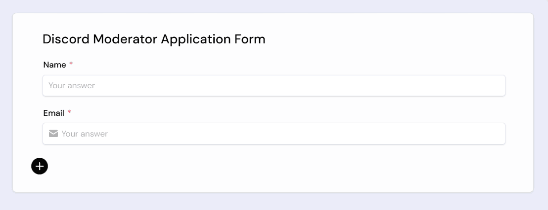
According to the Zeigarnik effect, people feel a need to finish what they start. Start with a simple question (such as name and email) to lower the barrier to entry and encourage users to complete the form. Limit PII questions to avoid making people feel uncomfortable or insecure. Also, use validation fields to ensure the accuracy of their information.

Start with a simple question to reduce friction and boost completion.
2. Use verification fields
Validation fields such as wallet verification, social media verification, and email confirmation,... help ensure data accuracy. Real-time validation is ideal for a smooth, frustration-free experience. This enables you to understand your users and build trust within your community.

Start with a simple question to reduce friction and boost completion.
3. Use the right number of fields
Strike the right balance with the number of form fields. Too many fields may discourage users, while too few can lead to low-quality leads. Tailor form length to your offer's value — keep it short for simple freebies, and add fields for substantial resources to better qualify leads.
4. Use microcopy for clarity
The counterpart to error messages, microcopy is best used to bring clarity to the user on why you need this information and why they should provide it. Done well, it is unobtrusive and can increase your conversion rate with the minimum of effort. Common uses for microscopy are:
Giving the user a heads up: Let them know what they need to do before starting the form so they don’t waste their time (e.g. have your portfolio)
Precise field names: A common issue in forms is field ambiguity. Think of the confusion between “Current Address”, “Home Address” and “Delivery Address”. Microcopy can make it crystal clear which information is needed and why.
Data entry instructions: If you have fields that have strict stipulations on how to enter data (although you really shouldn’t - see point 8), you’re best to use microcopy to make that clear to the user (e.g. “Enter all 13 digits on your card with no spaces”)
Sensitive data: If you are asking for personal information you need to make it clear why you want it and what you will do with it. See below for a good example of how to do this.

Telegram connection I Formo’s Form Builder
5. Highlight the required field
Mark necessary fields with an asterisk (*) to clarify which information is essential, reducing abandonment rates. Besides the regular form fields, you should have the required fields for job title, company fleet size, and primary vehicle type. This compulsory information leads to fewer, but better, leads.

Use an asterisk (*) to show required fields and reduce drop-offs.
6. Consider multi-page forms
Breaking a long form into multiple steps can prevent user overwhelm. Each page can gather different information, starting with basic details and moving to more specific questions. This approach helps users feel less burdened and more likely to complete the form.

Break long forms into steps to reduce overwhelm and collect info progressively.
The first page asks simply for the person’s contact information, while the second page gathers the main information. Creating multiple, easy steps prevents the visitor from feeling overwhelmed by the amount of information they need to share.
7. Avoid Lengthy Dropdowns
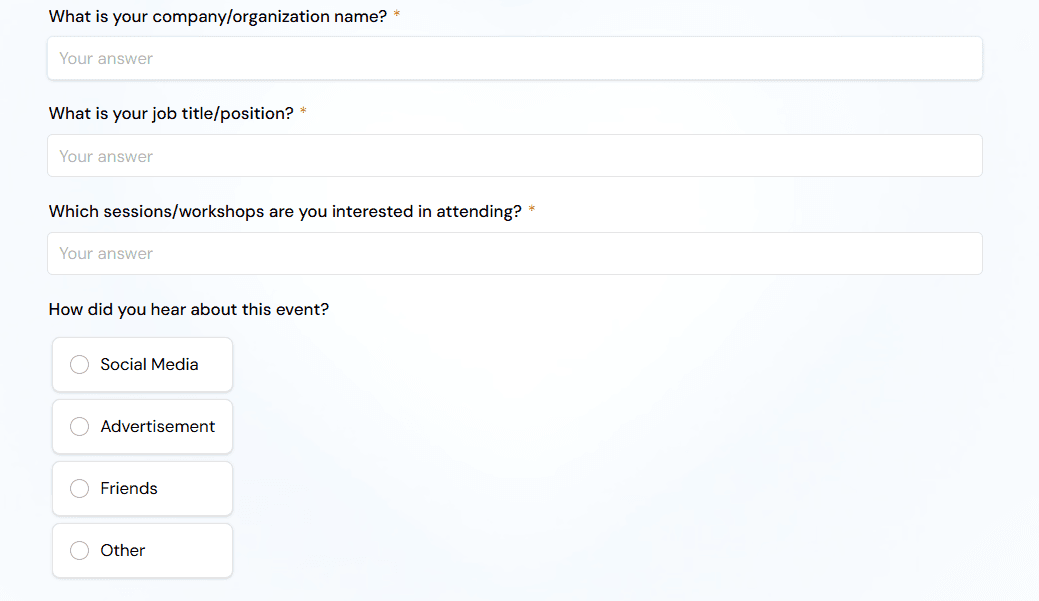
Long dropdowns can frustrate users, especially on mobile. Use concise options or alternatives such as radio buttons to make selection easier. Long dropdowns, such as selecting skills in an application, can lead to higher abandonment rates.
9. Choose an Effective Form Layout
Choosing the right form layout involves knowledge of user behavior. These small adjustments improve the user experience and reduce form friction. Here’s how you can optimize your form’s layout.
Place form labels above the corresponding input fields.
Only ask one question per row.
Match the size of input fields to the expected length of the answer.
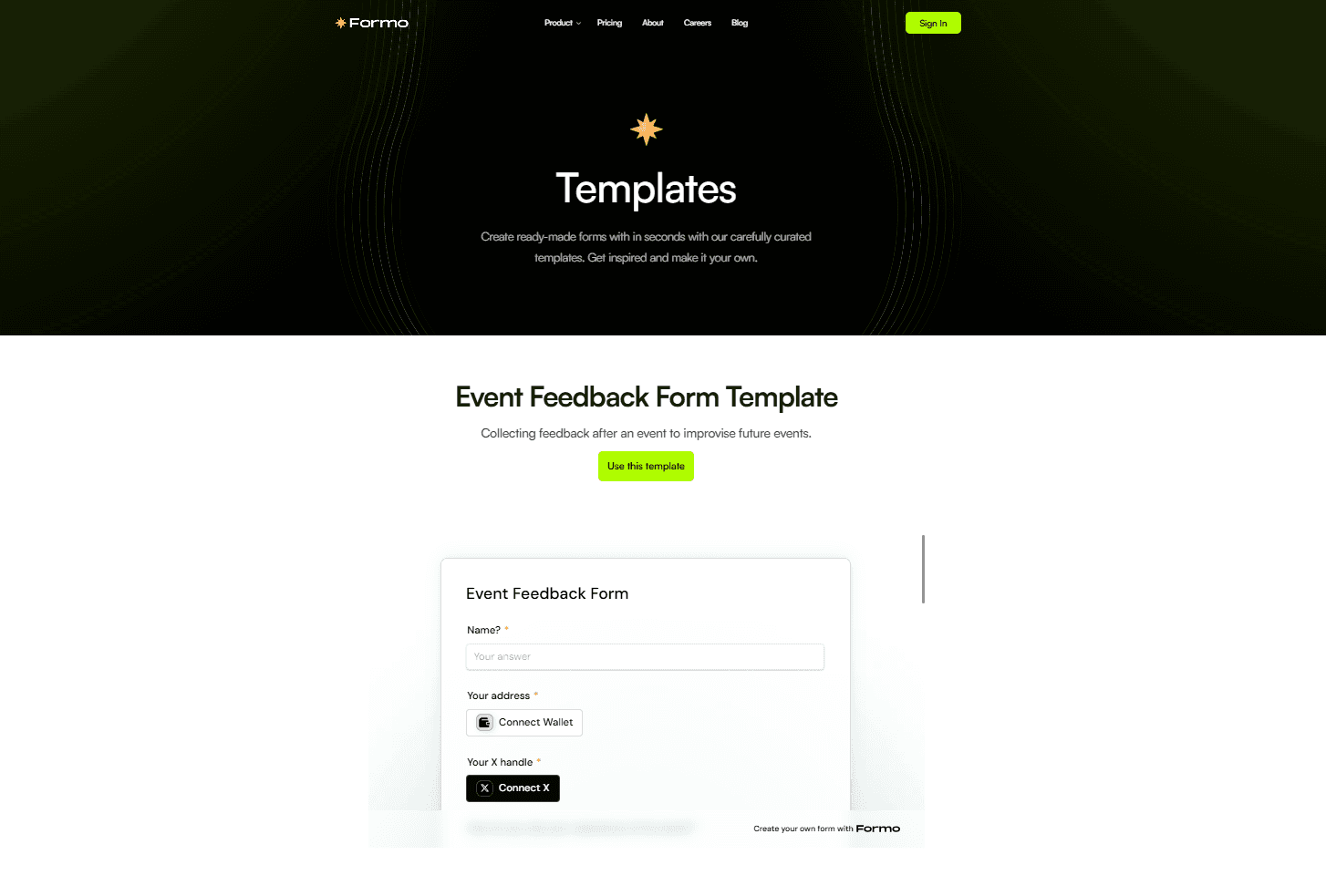
If you want to streamline your form building in seconds, just use Formo templates.

Formo’s form templates
10. A/B Test Your Form Design
Test different designs to learn what resonates with your audience. Understanding color psychology and UX is a great first step to picking the right design. Otherwise, if you want to find out what users resonate with, use A/B tests to find the design with the highest conversion rates.
Showcase your brand with Formo. Formo offers a variety of templates and unique features to create engaging forms that reflect your brand identity and help you make a lasting impression on your Web3 communities

Formo Form Builder
Getting Started with Formo’s Form Builder
Enhancing Web3 form conversion rates is a multi-faceted endeavor that requires a combination of personalization, mobile optimization, user-friendly design, accessibility, and continuous improvement. Each strategy is critical in improving user experience and driving growth in your Web3 projects. Formo’s Web3-native features enable quick testing and iteration, ensuring your forms remain user-friendly and optimized for your onchain user.
Further sources:
Follow us on LinkedIn and X, and join our community to see how Web3 leaders use Formo to drive growth in less time.
FAQs
1. What is a Web3 form conversion?
Web3 form conversion refers to the percentage of visitors who complete and submit a Web3 form, critical for collecting quality data and engaging onchain users.
2. Why do Web3 forms need optimization?
Optimized forms reduce friction, increase user trust, and lead to higher submission rates.
3. What are some top ways to increase form conversions?
Start with easy questions, limit the number of fields, use microcopy, break long forms into steps, and ensure mobile-friendliness. Short, simple forms convert better.
4. How do multi-page forms help with completion rates?
Web3 form conversion reduces cognitive load by spreading questions across several steps, keeping users engaged and increasing completion rates.
5. How can Formo help improve my Web3 form conversions?
Formo offers token-gated forms, wallet and social verification, real-time analytics, and customizable templates built for Web3-native engagement and growth.
6. What else should I improve other than conversions?
It’s important that you convert qualified leads. Having lots of submissions from low-quality leads is worse than having few high-quality leads. Enabling wallet verification and token gating helps increase qualified responses


